Want to be first to hear the latest news, special offers and insights from Viaduct? Sign up to our email newsletter. You can unsubscribe at any time, view our privacy policy here.
Frieze Offices London, Fleet Architects & Simon Jones Studio
A user-first rethink of the 'open-plan' office for arts organisation Frieze; Exploring modes of extroverted and introverted working and their creative implications.
Fleet Architects with Simon Jones Studio have designed a new headquarters for arts and media organisation Frieze. Readers will no doubt be familiar with Frieze's eponymously titled arts and culture magazine, as well as their annual art fairs held in London and New York.
Focussing on the duality of the word 'edifice' as meaning both 'building' and a 'prevailing systems of belief', Fleet Architecture's design approach avoids the imposition of these external influences in favour of a 'user first' philosophy.
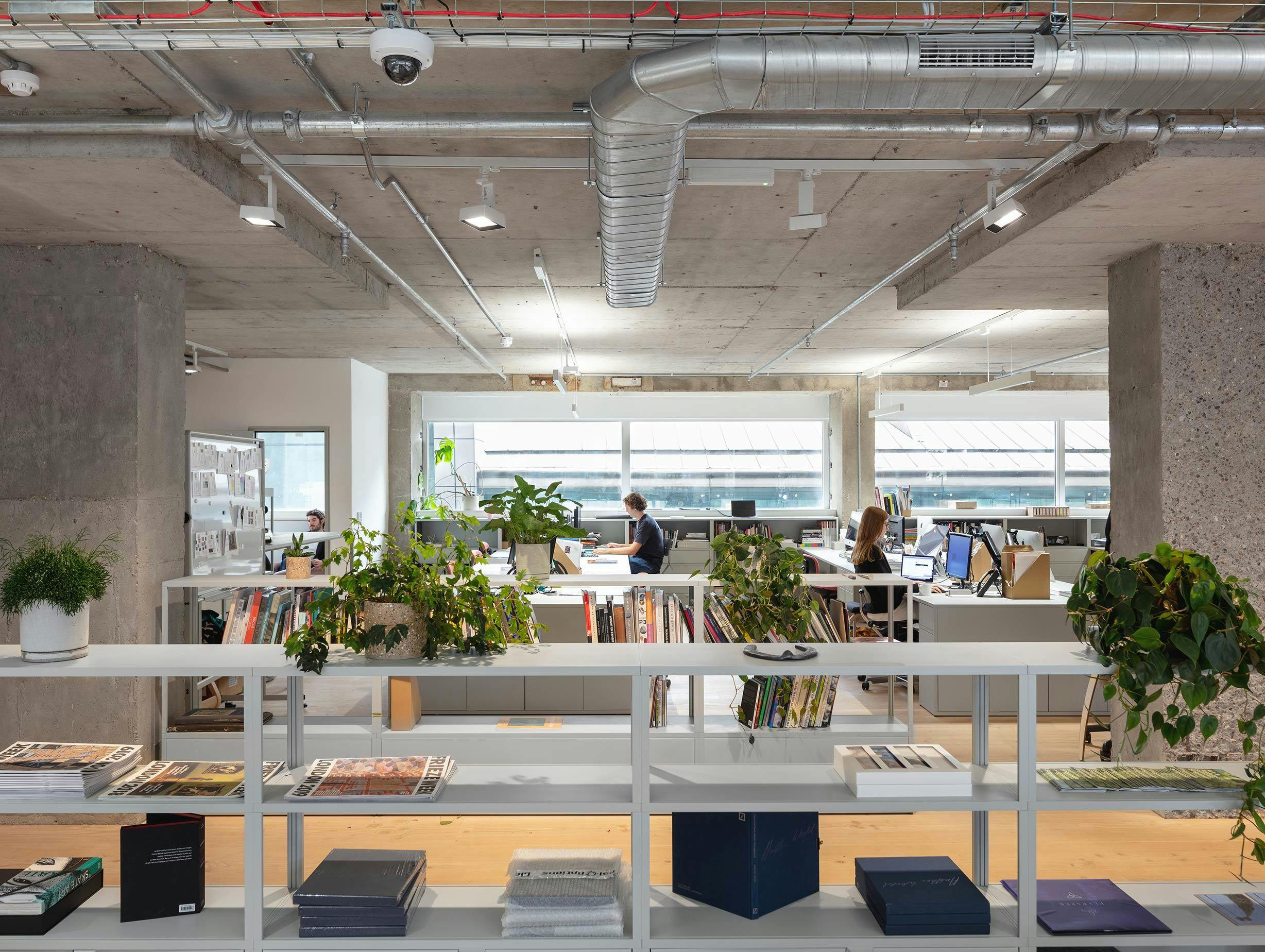
Recognising the imperfect nature of today's open-plan offices. The starting point was interviewing the Frieze team to understand existing ways of working, as well as the issues they often encounter. Armed with this feedback, the practice then looked to the conceptual origins of "open-plan" as imagined by Frank Duffy, architect, theorist and founder of DEGW in the 1970s. Duffy had envisioned the creation of 'organic spatial arrangements' based on the fluid relationships between individuals and departments. An ideal rarely realised in its modern incarnation.
For Frieze, Fleet Architects decided to return to this first principle of 'open-plan' as a dynamic series of spaces that allow for a variety of public and private interactions. Both Frieze and Fleet Architects were keen to avoid what Susan Cain, in her book "Quiet" (2013), referred to as "the reliance on the 'Groupthink' environment above the needs of the individual at work." Cain suggests that by calibrating our spaces for extroverted rather than introverted forms of activity, we actively hinder creativity.
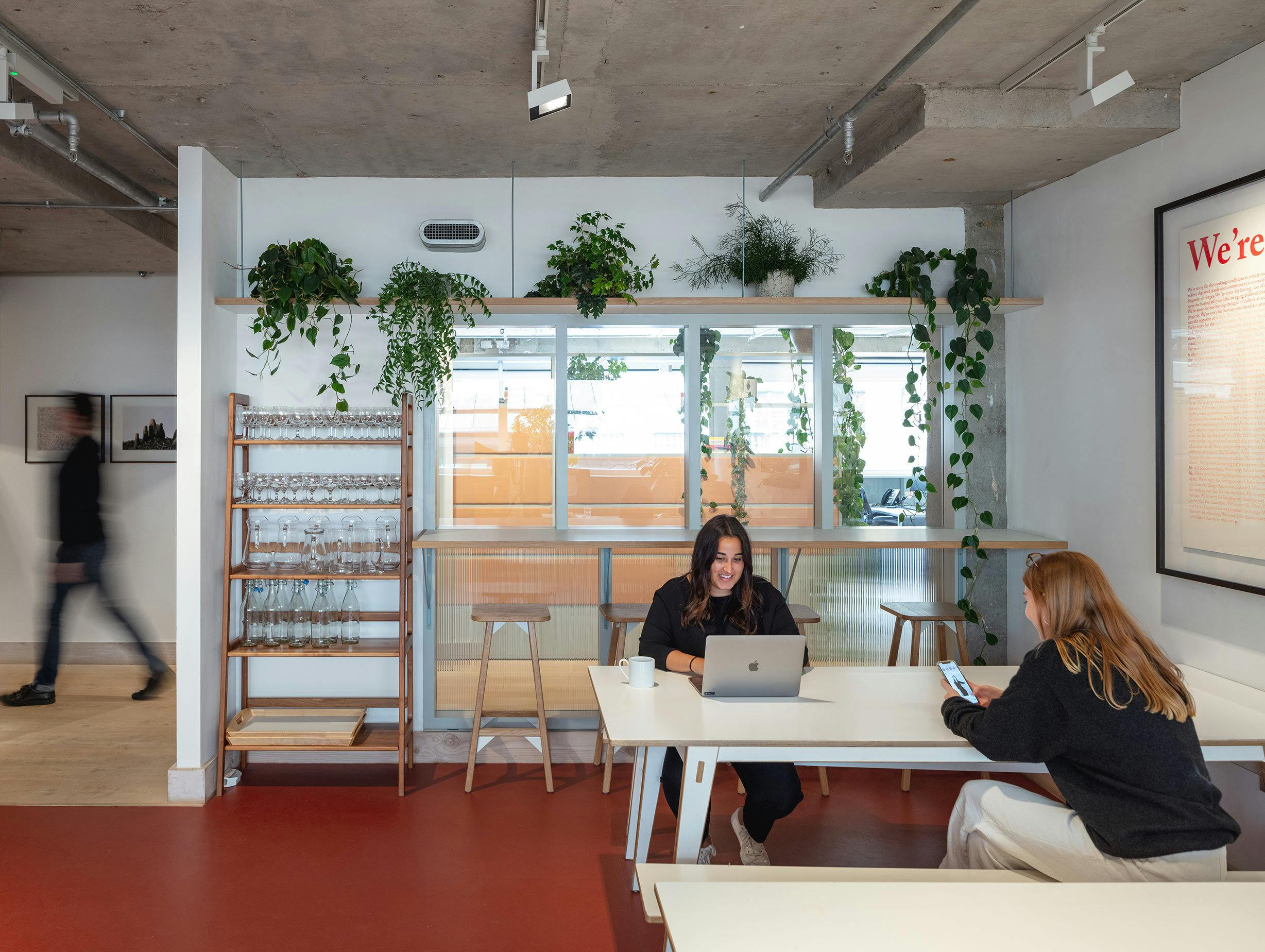
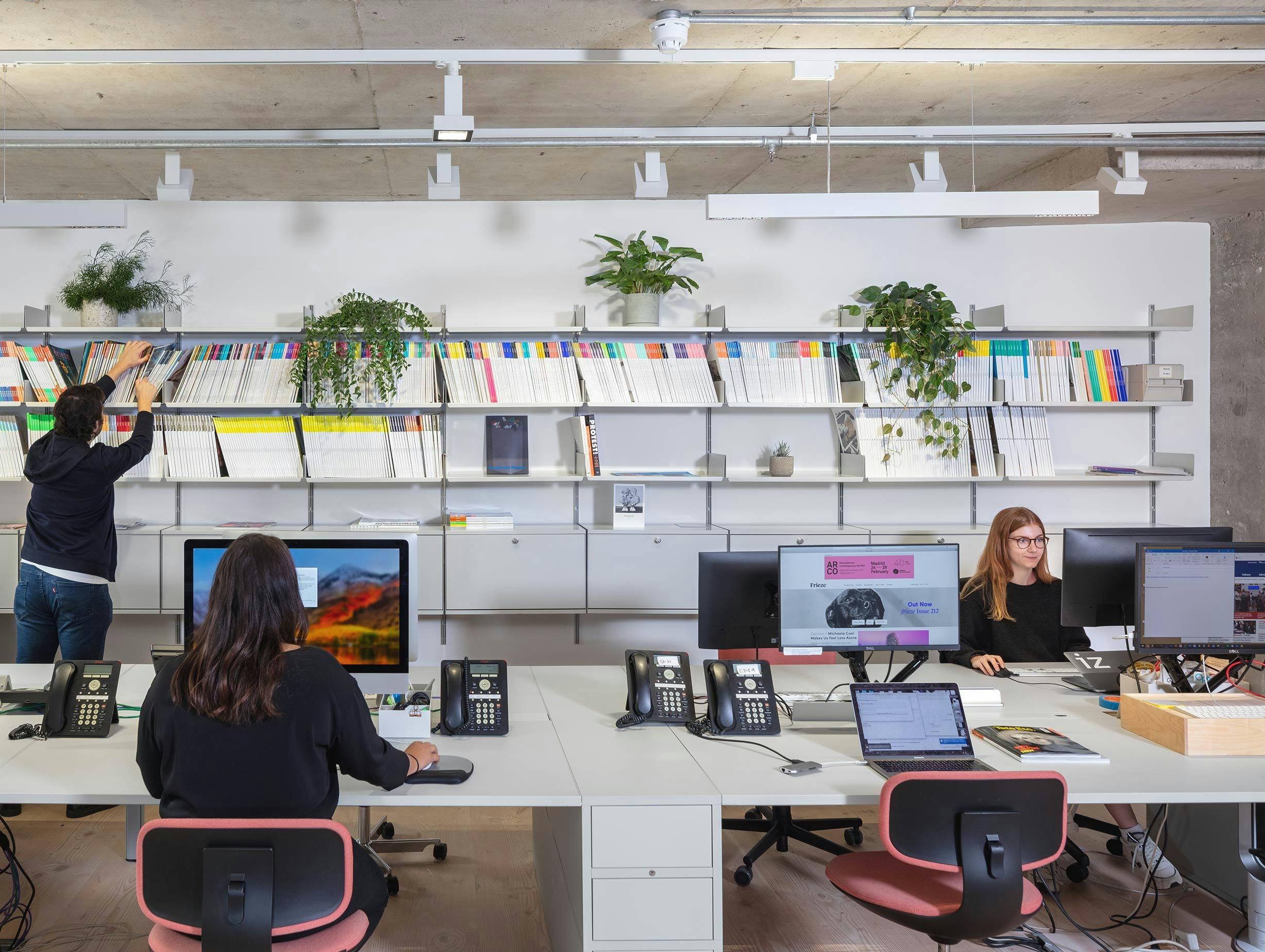
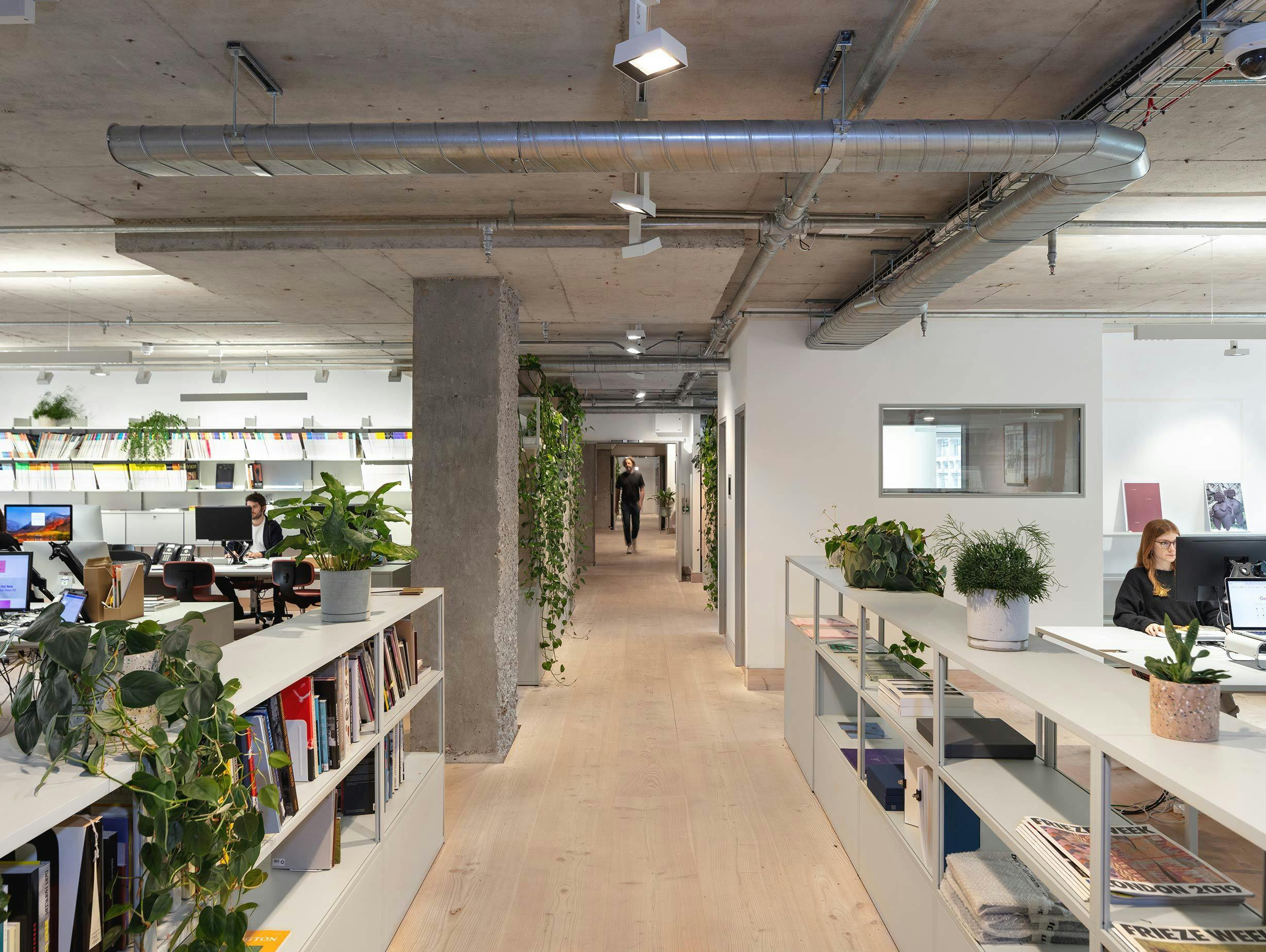
This led to the creation of several loosely defined office spaces, with the allocation of departmental neighbourhoods. Simon Jones Studio and Viaduct were enlisted to assist with the furniture and lighting concept. Simon Jones, also the designer of the Triangle leg series for HAY, crafted a series of custom tables and kitchen spaces that were augmented with loose furniture supplied by Viaduct.
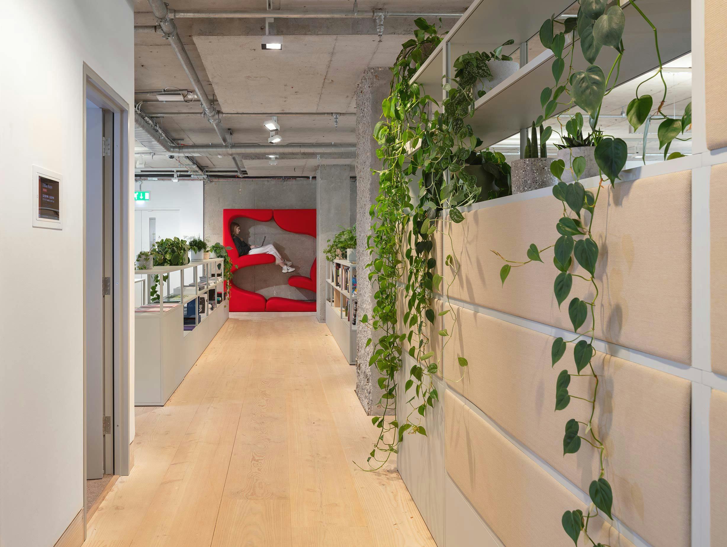
In particular, Hay's New Order system is used extensively throughout the design as demarcation, desking and storage. New Order is itself the result of years of painstaking research by Rolf Hay and designer Stefan Diez into the functions of the modern office, so it is an apt choice for the project.
The interior material palette focused on 'soft' materials such as cork, felt and carpet to contrast the austere concrete of the existing 1970s architecture. The interior architecture and furniture were carefully chosen to provide diverse ways of working, from shared workstations and meeting areas to private spaces for solo endeavours.
We use cookies to give you the best possible experience on our website. If you continue to use this site you are consenting to our use of cookies. Please read details about how we use your personal data and cookies in our Privacy and Cookies Policy. Click to hide banner.